Home
Background
The Disaster Connectivity Maps concept was first launched at the Global Forum on Emergency Telecommunications (GET-19), which took place in Mauritius, in March 2019.
Disaster Connectivity Map (DCM)
Disaster Connectivity Maps is a mapping platform to help first responders determine the status of telecommunications network infrastructure, coverage, and performance before and after a disaster. The information contained in Disaster Connectivity Maps (DCM) can be used to support decision-making by first responders about where telecommunication network services need to be restored. Disaster Connectivity Maps is a joint initiative of the International Telecommunication Union (ITU) and the Emergency Telecommunications Cluster (ETC), and with the support of the GSMA Mobile for Humanitarian Innovation programme. The Disaster Connectivity Maps platform is hosted by ITU.
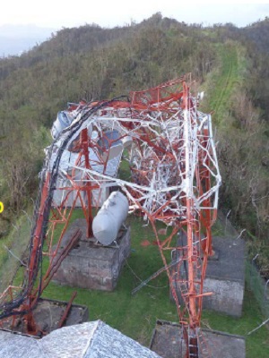
Picture credit: South Ridge tower, Telecom Fiji. September 2016 Radio Communication Experience, Telecom Fiji Ltd. Mesake Tuinabua, Manager Network Operations, Telecom Fiji.
What information is displayed on Disaster Connectivity Maps?
Disaster Connectivity Maps display the following types of information:
- Network infrastructure: physical features such as terrestrial fibre optic links, microwave network links, submarine cables, mobile cell sites
- Mobile network coverage: projected and/or actual mobile network coverage
- Connectivity performance: metrics such as ping, latency, throughput (download/upload)
Information displayed in Disaster Connectivity Maps is gathered from different sources. Where data is available, network coverage and performance information will be dynamically updated in DCM using near real-time data.
Download the Disaster Connectivity Map User Guide (July 2023).
The Disaster Connectivity Maps platform is hosted by ITU and developed as part of the ITU Broadband Maps and ICT-data mapping platform
Connectivity Indicators
Select which connectivity measurement indicator to display.


GSM coverage signal strength

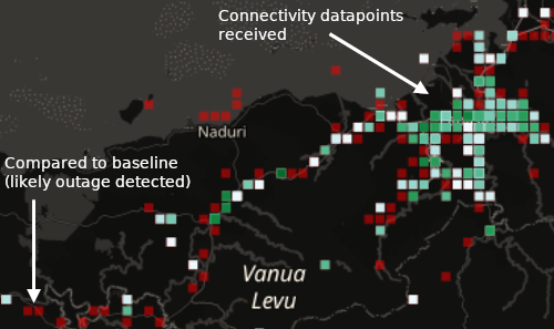
 by realtime connectivity datapoints. This dynamic layer is created by the on-the-fly filtering of individual cells in the GSM coverage by the real-time connectivity datapoints received. Changing the timeframe therefore changes the cells which have been detected in the selected timeframe. This layer is only available at a scale of 1: 300,000 or less due to limitation of 1000 datapoints which can be processed.")
Settings
Accessing DCM via desktop GIS software
The map layers published through the DCM Geoserver platform can be directly accessed in WMS (Web Map Service) format in desktop GIS software. More detailed notes are available in the DCM User Guide (July 2023). The worked example below uses QGIS desktop GIS software. Note that minimum QGIS version 3.14 is required for the Temporal Controller function.
Adding WMS map layers
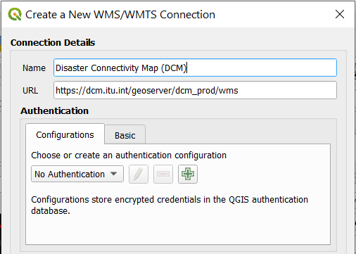
In the Data Source Manager of QGIS, select the WMS/ WMTS option. Alternatively navigate to Layer – Add Layer – Add WMS/WMTS Layer, or use the keyboard shortcut Ctrl+Shift+W.
In the dialogue box that appears, select New to enter the parameters to create a new connection to the DCMs WMS server, enter the information below, and click OK. Then press Connect to load the available map layers. You can then browse the layers which are published, select a layer and click Add.
Name: Disaster Connectivity Map (DCM)
URL: https://dcm.itu.int/geoserver/dcm_prod/wms
No password is required for the publicly available map layers. Password protected content is exposed to authenticated users who enter their username and password.
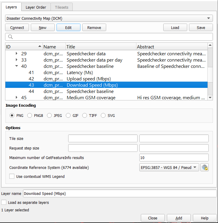
Select connectivity indicator
The DCM map layers contain four connectivity indicators: download speed (Mbps), upload speed (Mbps), latency (Ms), and mobile coverage detected (yes or no).
In the web map, the indicator can be changed using the drop-down menu in the Connectivity Indicator tab, which changes the style to display a different indicator. In desktop GIS, the different indicators are shown instead as options below each map layer in the menu.
From each map layer (for example Speedchecker baseline), click the triangle to display the connectivity indicators which are available (for example Download Speed (Mbps)), then select the chosen layer and click Add to add that to the map. Note that the colour scheme and legend has changed depending on the indicator selected, and only those datapoints with values for the selected indicator will be shown.
Time control
Note that some map layers in the DCM are time enabled (called WMS-T, or WMS-Time), and other layers are not. When the layer is added to the map in QGIS, a clock icon appears to the right of the layer indicating that it is a Temporal Layer. The DCM Infrastructure, QoS baseline and Speedchecker baseline map layers do not have a time dimension. All of the other map layers contain a time dimension, which must be set using the Temporal Controller otherwise there will be nothing to see since the time parameter has not been defined.
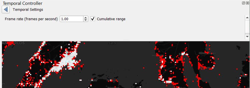
To display the Temporal Controller in QGIS, select View – Panels – Temporal Controller.
The Temporal Controller allows you to configure the start time, end time, the interval (hours, days, months etc) and the number of interval steps (1,2,3 etc). Using the bookmarks from the drop-down menu in the Disaster Event tab in the web map, you can find the start time and end time for each activation. The interval step should be set to 1 day, although in some activations this is also available for every hour, and for the archive Quality of Service layers this is set to quarterly (so 3 months). You can now use the play, next frame and fast forward buttons to examine the data for individual days.
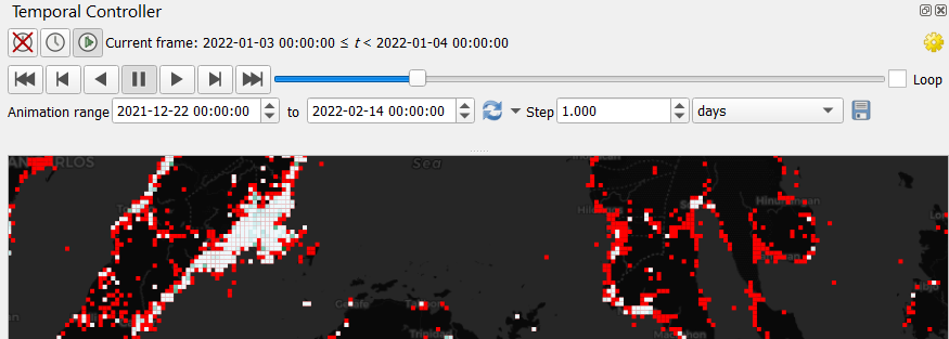
In the Temporal Controller's settings (yellow gear) button on the right hand side there is a Cumulative range button. By default the data is presented in sequential time slots, advancing the interval steps shows the data in the currently selected time slot, for day one, then day two, day three etc. With the Cumulative range button selected, all data is shown from the start date to the currently selected time slot. This feature is useful to identify areas highlighted in red which have persistent network outages.